
Web design is all about looking to the future. Because of its relationship with technology, the digital realm can be a showcase for new innovations in animation, interaction and overall immersion each and every year. Let’s dive into some of the top web design trends in Malaysia for 2022.
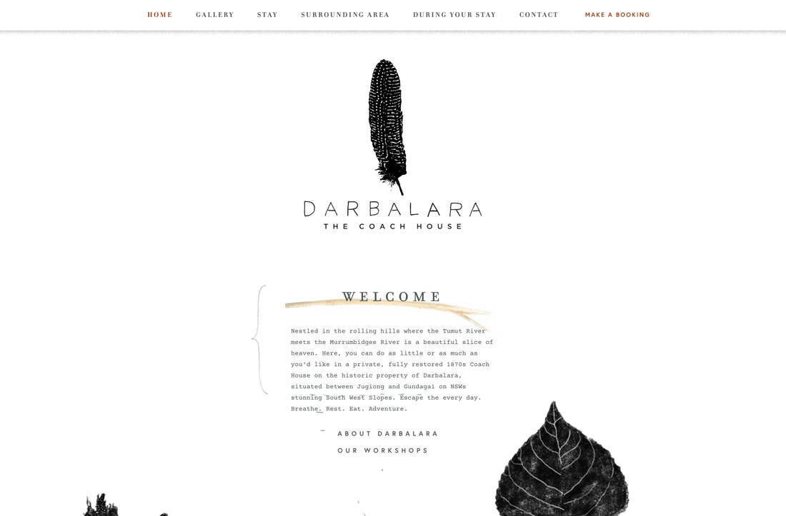
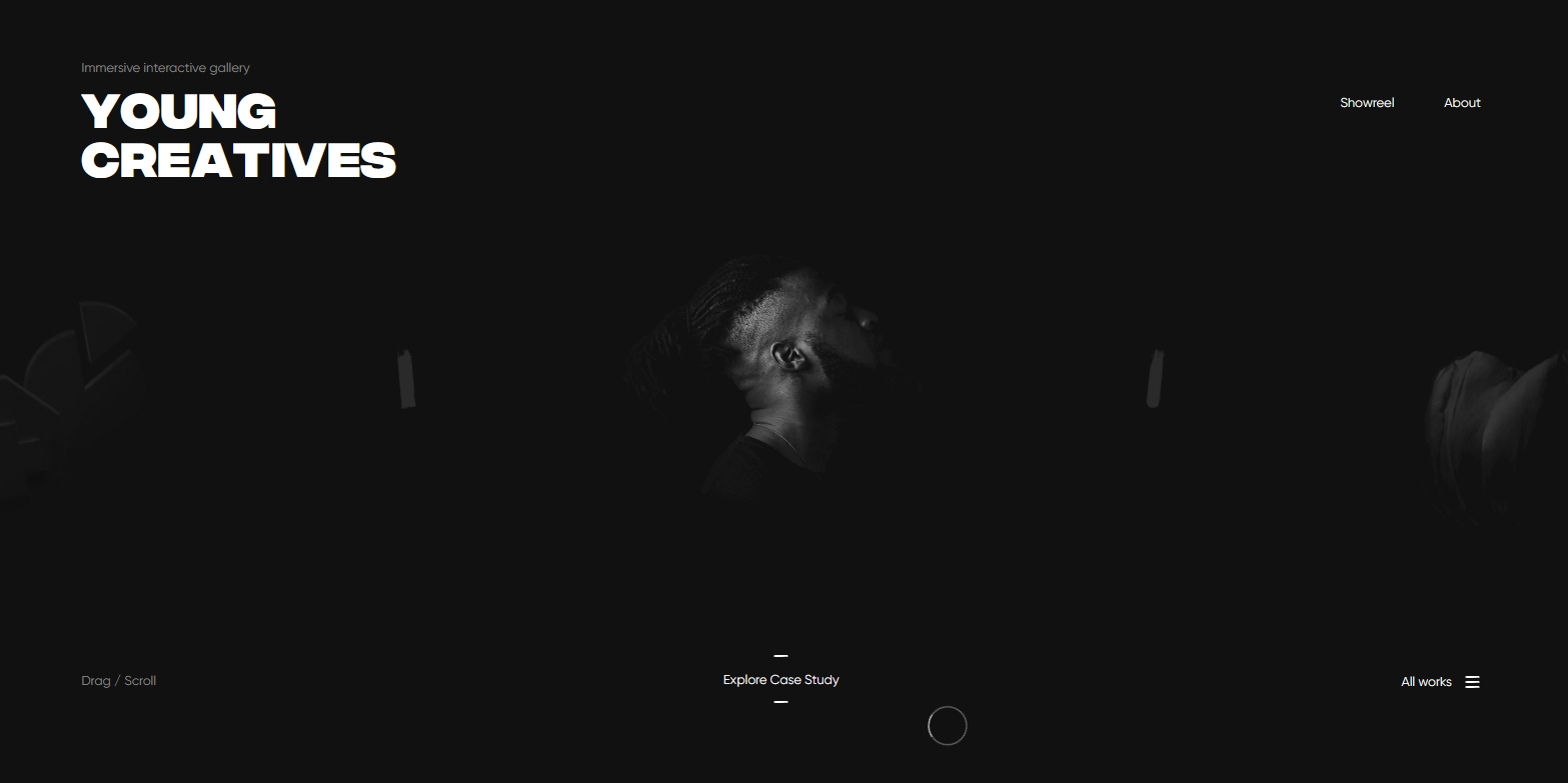
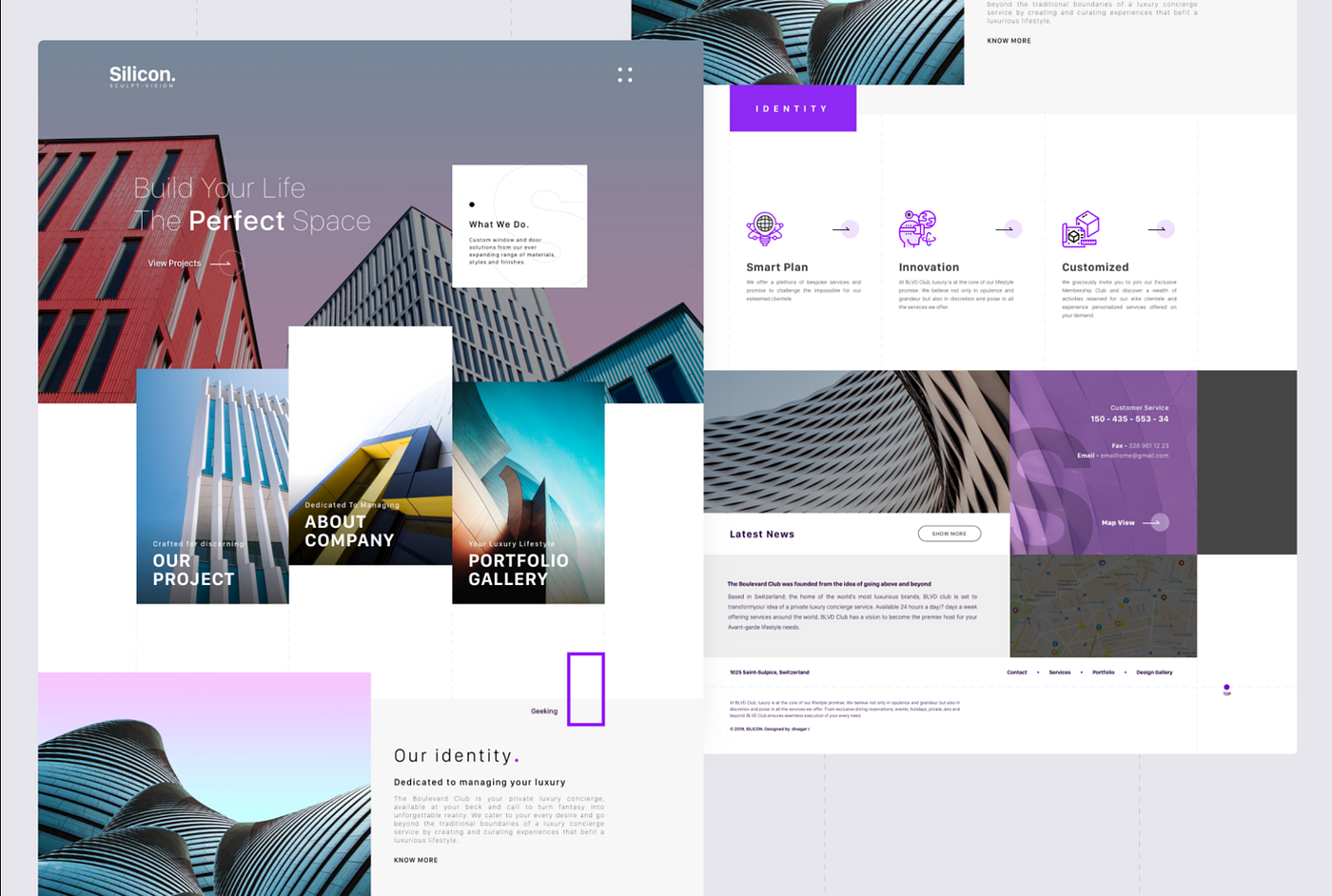
1. One-page websites
One-page website that forgoes menus and navigation in favor of simple scroll navigation is getting popular. It works best when their subject matter is narrower, like a portfolio or the presentation of a single idea. This digital resume website makes it easy navigation to all the informations.
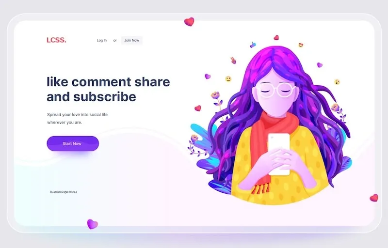
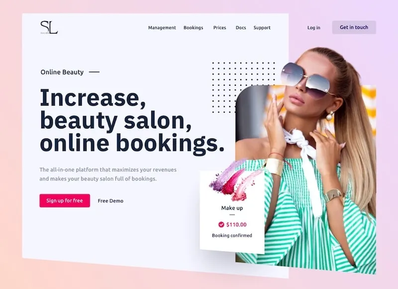
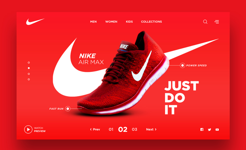
2. Full Height Homepage Hero
The full-screen hero section is getting popular nowadays. A hero image serves as a powerful dominant element that communicates the primary message quickly.
Like a giant billboard, making your homepage hero section full-height can focus your users’ attention and serve as distraction-free messaging. Credit: By Zahidul on Dribbble
Take the full-screen hero sections as an opportunity for perfect storytelling. Credit: By Emy Lascan on Dribbble.
3. Comfortable Colors
For the last several years, trends in web design have focused on bright, high-contrast designs. In 2022, some designers will shift to the softer color pallets. This comfortable color schemes utilize warm and natural greens and brown or light pinks and pastel blues.
“Excess of anything is harmful”. Well, can’t disagree. Dramatic innovations i.e unnecessary usage of fonts, colors, too bright outlay, etc. can be a minus point to your site. So, web designers have been taking this into account with color schemes that are easier for the eyes. For example, wholesome greens, pastel blues, warm browns, or light pinks. Credit: By Davina Spriggs on Dribbble
This trend overall is something that web designers of the future may be more concerned with accessibility and comfort than the overuse of colors.
 4. Text-Only Hero Images
 4. Text-Only Hero Images
A combination of beautiful lettering styles and a secondary typeface to pull it all together are important to make this trend work. Everything needs to be highly readable and the typefaces need to have a distinct flair without being overwhelming.
Look for a personality-filled sans serif or a readable novelty option and pair it with something neutral for the most impact.
5. Dark Mode
Dark mode web designs serve a couple of different functions. On the practical end, they help reduce eye strain, a concern for many as we are spending more and more time looking at screens.
On the aesthetic end, dark mode easily creates an ultra-modern look for your website while giving you the ability to highlight other design elements just by darkening the elements that surround it.
 The use of dark modes in web design can reduce eye strain. It is common on websites and applications consumed in low-light environments. Source: Netflix.com

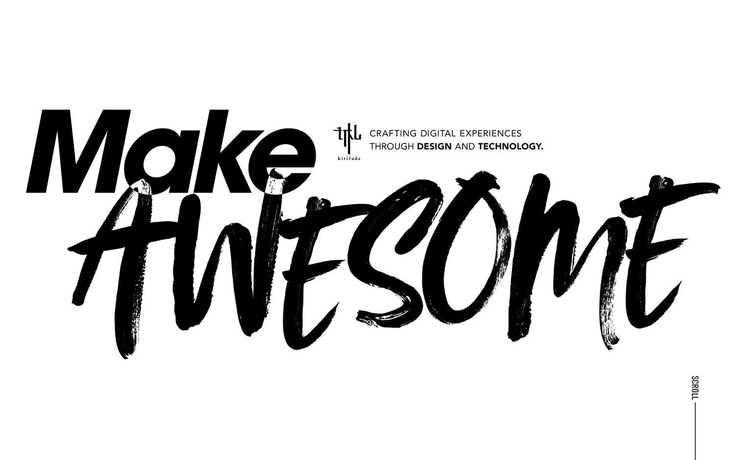
6. Oversized typography
Typography of unusual size is a fresh, bold design trend for this year. This is a versatile technique that can be used in minimalist or maximalist designs just as effectively and can suit many different styles.
This film portfolio website for Eva Habermann overlays large text onto a moving film portfolio reel. The text partially blocks the image, making the viewer curious to see more, and a sans-serif font in two colors gives just the right amount of contrast without being illegible or overwhelming.

David Calle’s portfolio site uses oversized text to create a sophisticated, ultra-minimalist design. The neutral background color and serif font combine beautifully with subtle animated movement as the viewer scrolls.

In the example here Kirifuda uses a beautiful black and white color scheme with an overprint effect between text elements. Oversized typography and a handwriting style typeface help pull it all together.
A design without images is also a great opportunity to try other techniques as well, such as animations, hover states, or other interactive elements.
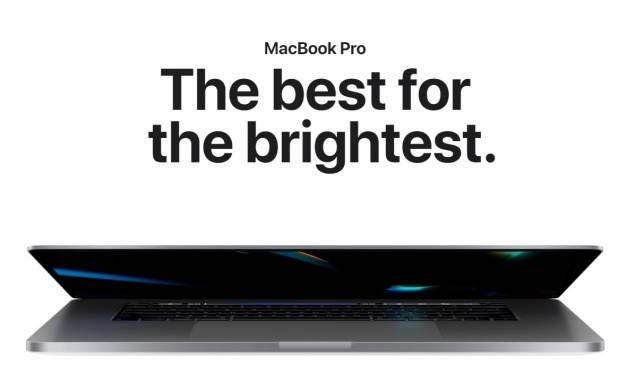
7. Bold Typography
This website home pages, created by a web designer on Dribble, perfectly exemplify the simple and modern nature of bold typeface.
“As design leans towards more minimal off-grid layouts, big typography helps tie it all together and offers simple brand impact,” explains Vail Joy, Envato Content Specialist.
French department store Galeries Lafayette’s navigation menu features a neutral, bold type – allowing the brand’s large logo to stand out in the center of the homepage. This, paired with vertical cut-out images, illustrated icons, and a monochrome palette, creates a crafty, collage feel.

8. Minimalism
Minimalism is a classic yet trendy approach to web design that remains popular. The minimalist design aesthetic combines beauty and function. Every design choice from images and fonts serves a purpose. The goal is to trim out any extraneous design flourishes until you’re left with the essentials. Common characteristics of minimalism in modern web design include:
- User-friendly and intuitive navigation.
- Simplified color schemes of three or fewer colors.
- Creative and bold use of typography as a design element.
- Avoiding the use of overly animated transitions.
- Simple, flat backgrounds instead of heavily textured backgrounds.
Below as Nike’s extensive clean monochromatic color scheme and simple UI exemplify minimalist design. Source: Nike.com

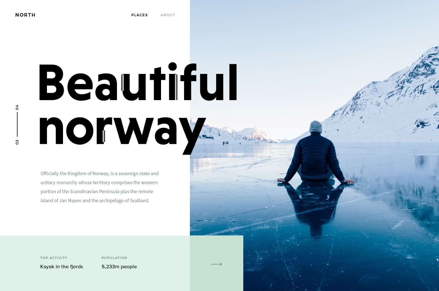
9. White Space
The use of white space is about giving content room to breathe, not trying to cram the most information possible on the screen. The experience is more relaxing for your website visitors, the content stands out better, and readability is improved.
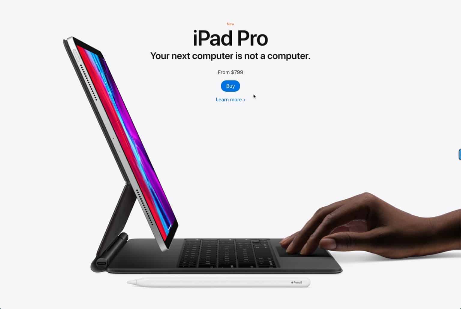 A well-crafted design with a minimalistic approach is something every web designer loves, as it is easy to deliver the message as well as the required information. Credit: Apple
One reason that white space is so popular is that it can help bring focus to a certain part of the design — the space occupied by something, rather than nothing. White space also has a beautiful, classic feel that’s easy to adjust for any number of projects.
10. Blending Photos with Graphical Elements
You might have noticed overlapping graphics on images in your social media feed. This mixing technique brings a level of creativity and fun to a typical image.
The trend is also catching on with websites. Mixing photography with graphics can reinforce your company branding and keep website visitors engaged with your content. Credit: By Kevin on Dribbble
Who doesn’t like such creativity..!!? Overlapping graphics on images bring a touch of creativity and interactive uniqueness to a typical image. Besides, mixing photography with graphics can boost your company branding and keep website visitors engaged with your content. Credit: Useplink.

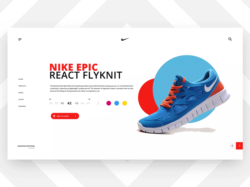
11. 3D Colors
Using shades to create depth on backgrounds and images helps these elements jump off the page.The gradient in the background image creates a sense of depth as if the screen has different physical layers. Source: Apple.com

Two colors side by side might abruptly smear together or they may retain the depth and shadows of painted objects. In the end, this trend suggests that this web design trends are aspiring to higher realms of realism. Credit: By Mike On Dribbble

12. Frosted Glass Effects
Recent advances in web technology have allowed the easy implementation of the frosted glass effect on websites. The glassy look adds an awesome touch to the scene. It gives a semi-transparent and blurry appearance of elements behind another. Credit: Study Call 3D By Ceptari Tyas

The blurry appearance of elements behind the frosted glass overlay helps add color to an area while also allowing text or objects to appear over the image and remain readable. Credit: By Herdetya Priambodo on Dribbble It’s a popular option for designers and it’s been used as a background in place of gradients.

13. Contemporary Serifs
Embracing the delicate decorative elements and elegant flourishes distinctive of the traditional serif, contemporary serifs are also being paired with fun, complex gradients for a trendy, modern look.
For example, this website from brand strategist Charlie Osborne features a subtle serif style, which is the hero font of the page while also being elegantly understated.
To incorporate contemporary serif typefaces in your work, this Black Delights – Elegant Serif by mokatype uses loopy ligatures and emanates a sophisticated style. Ideal for quotes or logos, it’s an eye-catching type that will set your designs apart.

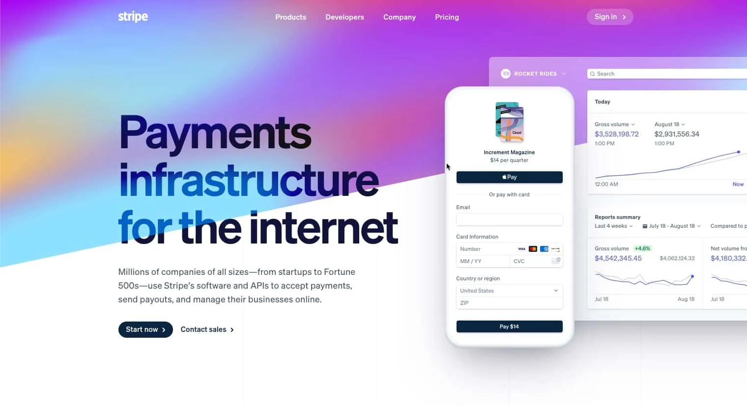
14. Gradients
Gradients are a long time trend that has evolved from subtle color overlays to eye-catching backgrounds.
Gradients can be used to add depth, serve as a striking background, or subtly to add texture to an illustration. We increasingly see it used in bigger and bolder typography. We’re excited to see the continual evolution of its use on websites.
 Recognizing the popular trend, ColorSpace has created a website with gradient designs that also functions as a tool for generating gradients and color palettes making it simple to generate your own unique design. We expect to see more and more gradients incorporated in new website designs in 2022.

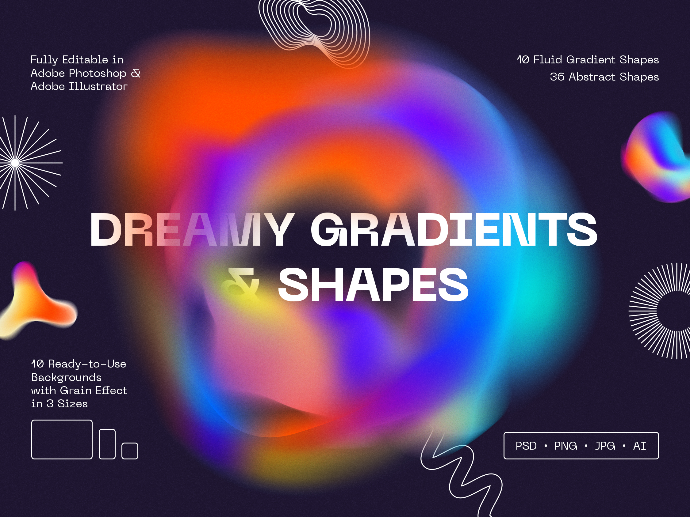
Complex gradients are one of the more recent developments to emerge in video and web design, and are often used to add depth to flat images.
You can see the use of complex gradients in action in this graphic design portfolio, which uses an ethereal mix of orange, pink, purple and blue hues to add warmth and depth. Creative agency Zeus Jones uses a similar effect on its website, with the design fading from monochrome to color.
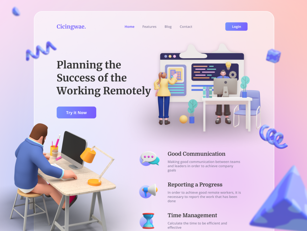
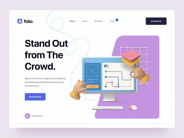
15. Illustrations
The illustration is a vibrant and awesome form of visual communication. It combines the message clarity of graphic design and the expressive capacity of fine arts. At its peak, the illustration does something that photography can’t. It portrays what is familiar from a perspective that is unattainable with human eyes. By Pikisuperstar on Freepik.

16. Virtual Reality
VR experiences on websites will keep increasing over the coming years. Think of furniture sites like IKEA that showcase what furniture would look like in your room..!!
VR can surely be a powerful tool for a website to convey meaningful, interacting, and useful, content to a site visitor in a way that helps them make buying decisions more easily. Credit: Volodymyr Kurbatov on Dribbble.
17. Interactive 3d Content
3D is definitely the hot trend in web designing. It is captivating, engaging, exciting, and gives an awesome feel to visitors. Credit: Xeniac on Uplabs.
3D elements have been in trends for a long time and it is one of the evergreen trends that is not going away soon. So, unleash your creativeness with the astonishing 3D elements. Credit: By Ilham Maulana On Dribbble.
Interactive elements like questions, quizzes, polls, and other engaging graphics will help keep interested in your site. It is a great way to provide value for visitors, get them to engage with your website, and learn more about them.
If your design is interactive it will automatically create curiosity as well as interest for your company as well. Make sure you keep this in check while designing your new website.!! Credit: By Cuberto on Dribbble.

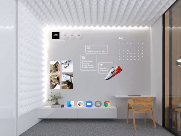
18. Floating Elements
Another interactive and visually appealing thing to have on your website..!! Soft shadows and floating elements add interest and depth which gives your web page a “3D Lite” look. That makes it highly engaging and intuitive.
Be creative, and integrate it with texts and photos, as well. The creative touch is something that catches the visitor’s attention the most. Credit: Folio By Tran Mau Tri Tam.
Some of today’s best web designers are capitalizing on this functionality to create websites that respond dynamically to user interactions in an almost game-like way.
19. Art Deco-Inspired Motifs
Art deco emphasizes geometric shapes and strong angles and linear movement. It came out of a strong desire to separate the new from the old, and embrace a future defined by technology and progress.
Today, web designers are drawing from art deco to inspire the creation of websites that are elegant, bold, and intuitive. They combine elements of the natural world with the symmetry and power of technological progress, recreating the quintessential modernist approach to design.
20. Neo-Brutalism
The defining characteristics of digital neo-brutalism include unstyled HTML, plain backgrounds, and asymmetrical layouts. Unadorned computer fonts and untreated photos are also part of the neo-brutalist design framework.
The overall effect of this approach is a stark, arresting atmosphere that demands user attention. It is restrained in character, but also bold and striking. That restraint is exactly what makes the content so bold, especially in comparison with the overwhelming, everything-and-the-kitchen-sink style of web design that is now experiencing rapid decline.
21. Organic Shapes
Organic or fluid shapes are anything that doesn’t involve straight lines. Fluid shapes are a great way to break up sections of a website without harsh lines or angles. They’re also great to use in the background.
It gives a cool and visually enriched look that can attract the visitor to surf more. Credit: Freepik
22. Asymmetric layouts
Websites now are specifically taking this idea to a huge scenario. Broken-grid layouts are kind of more attractive due to their distinguished distinctiveness and stubborn assertiveness. A little bit messy is fun…!!😜
Although, a brand website has to tread lightly with this trend. Visitors may find the content unreadable and overwhelming. So, in that case, brands have to maintain a balance between asymmetric layouts and powerful backgrounds. Credit: By Divagar on Dribbble.
As above, every year our designer team is committed to research and compound our own list of Web Design Trends as to reflect the trends in Malaysia for our clients.
We understand that website design is the process of planning, organizing, and arranging content and ideas online. Core web designing is not only about the visual appeal; instead, it is more about functionality. The intention is to present content on electronic web pages so the end-users can access it when needed. The visual key elements of website design are as follows –
- The Layout: The developers arrange texts, graphics, and ads for customers to find all information they are seeking. Maintaining integrity in design, balance, and consistency is necessary.
- Fonts: The choice of fonts enhances the efficiency of website design. Its combination with color, scheme, image, and graphics decides the overall website tone.
- Colour: The proper color selection depends on the website’s purpose and clientele. Ensure to consider the color psychology, as it complements web design and conveys an ideal brand message.
- Graphics: Graphics include photos, logo, icons, and clipart. It should be made user-friendly at par with the website’s font and color implementation.
- Spacing: Proper incorporation of spacing makes your website look organized and easily navigable. It critically balances the text, graphics, and photo. Modern web designers prioritize whitespace to a significant extent.
- Content: Create optimized website content that is relevant, informative, and understandable. Incorporate the correct keywords and align them with your brand quotient.
Learn more of our Web Design Portfolio.