
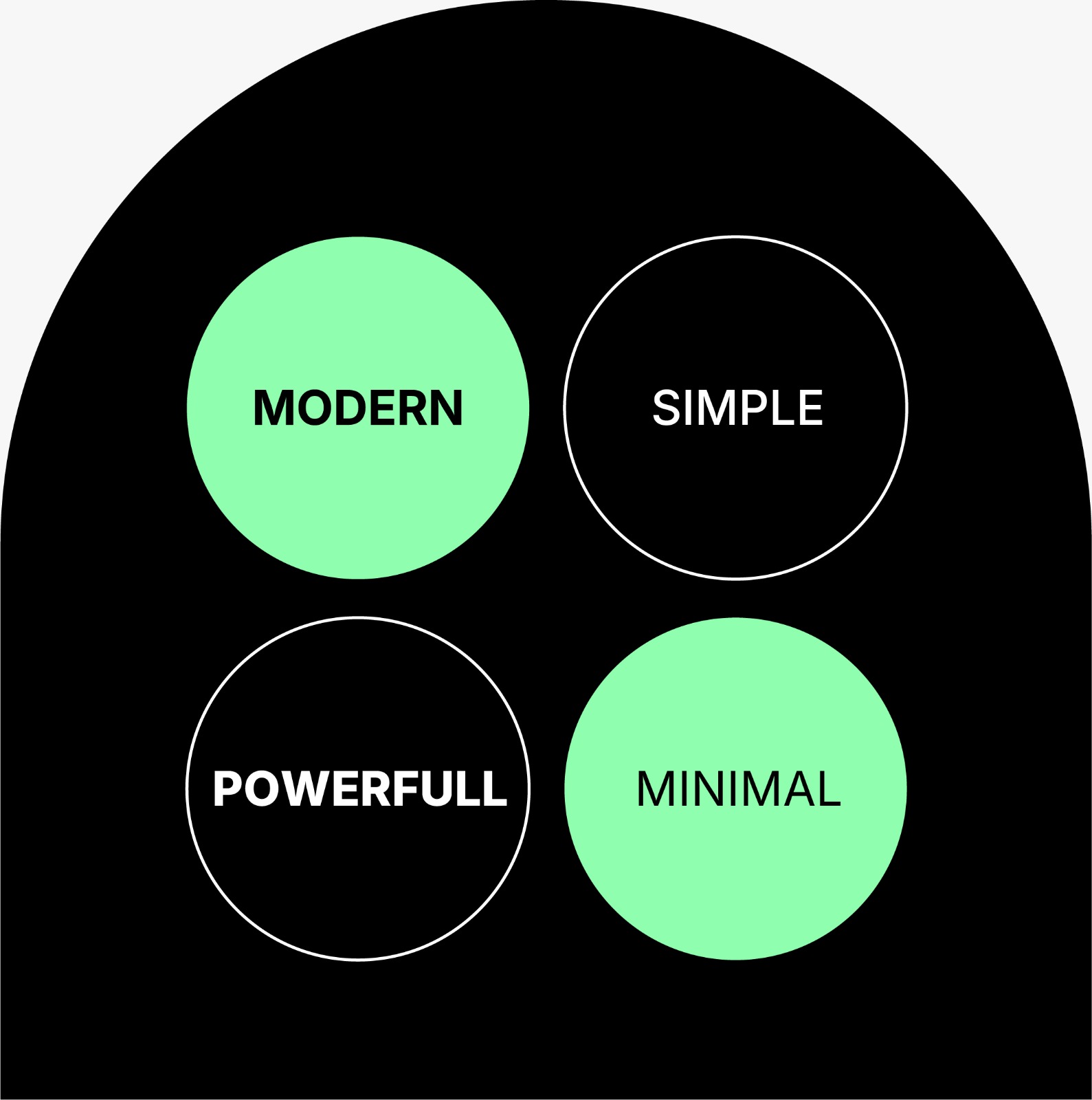
A logo is more than just a visual mark - it's the face of your brand. It reflects your values, your personality, and your purpose.
That’s why every great logo begins with a great brief.
Share your story and goals so we can craft a logo that truly represents you.
Let’s bring your brand to life - starting with this brief.
From simple details to bold ambitions, this brief helps us shape a logo that captures your essence and connects meaningfully with your audience. Every answer you share brings us closer to understanding your story, your style, and what sets you apart.
Together, we’ll create a logo that speaks for your brand — confidently, clearly, and with purpose.
Logo Design Creative Brief
Start your logo design by filling out your creative brief below.
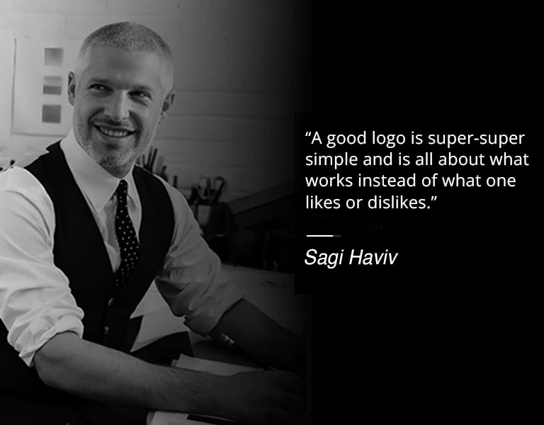
*Need help with your creative brief ? Contact Adrian via WhatsApp or call at 012-822 7532 (Mon-Fri, 8 AM – 5 PM MYT).